- Animation
- Branding
- Guidelines
- Illustration
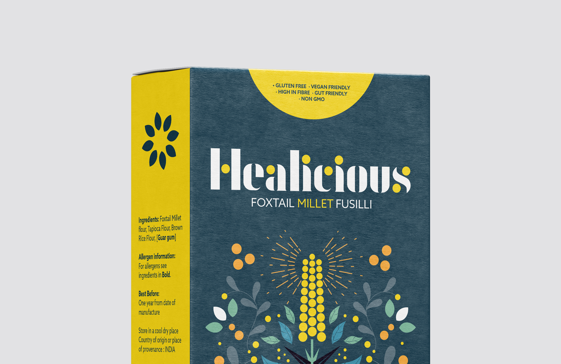
- Packaging Design
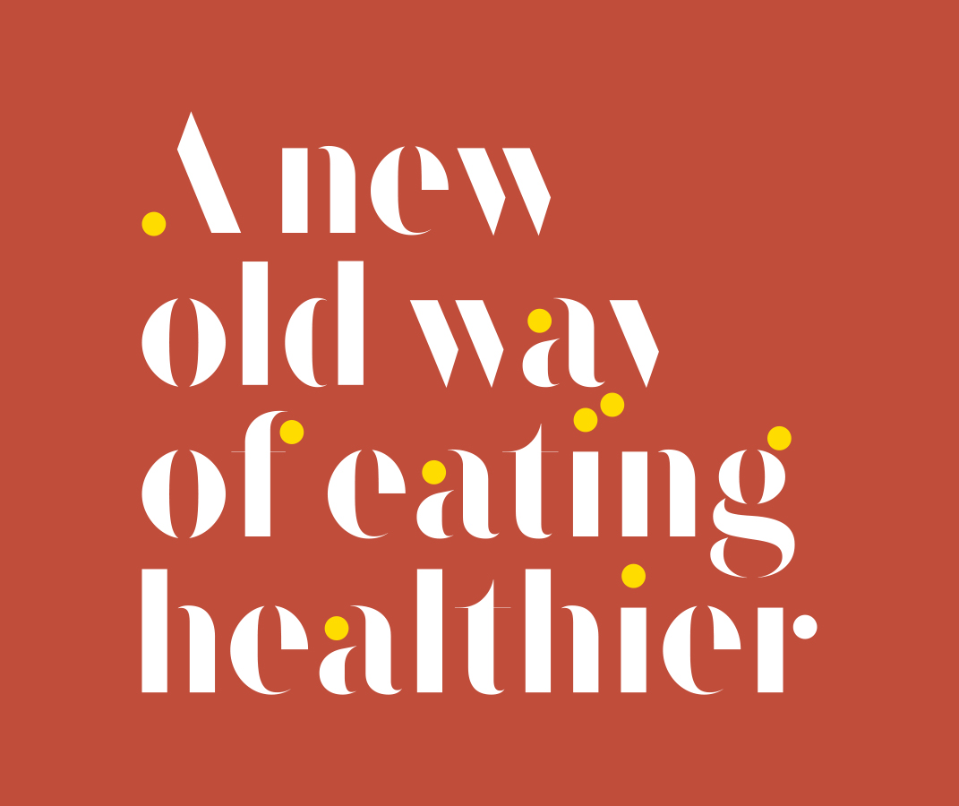
- Typography
- Transform Awards winner
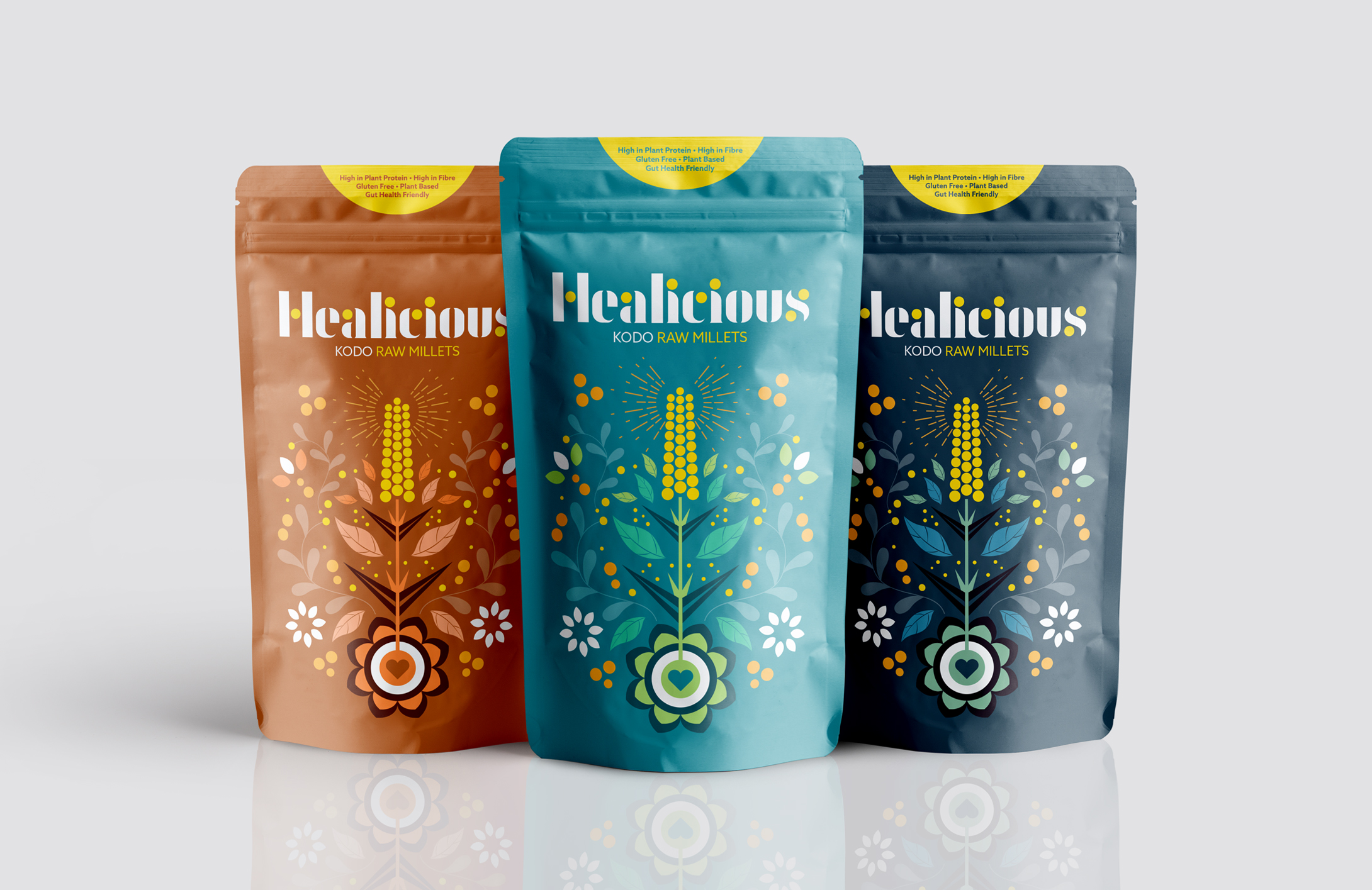
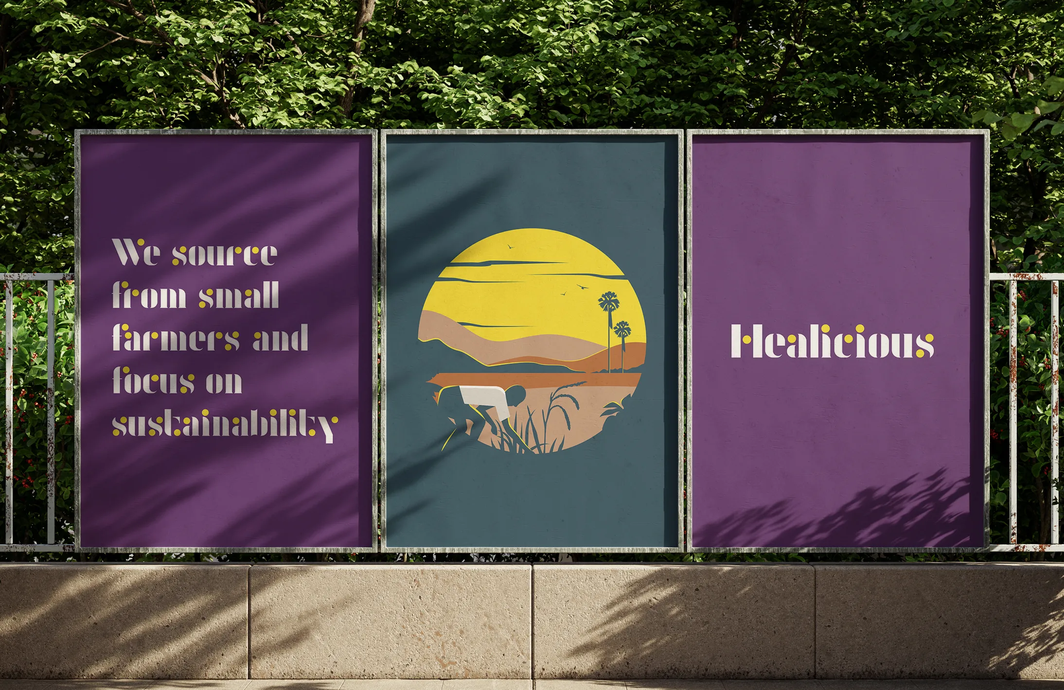
Healicious
Millet is one of the oldest cultivated grains in the world and has been grown throughout Africa and Southeast Asia for thousands of years. Healicious is a celebration of this ancient and powerful ingredient, repackaged and recreated for the modern world.
Our brand identity for Healicious celebrates their passion for the superfood and also the goodness found inside this simple grain. The brand mark features the millet at the heart of it, coupled with a custom font crafted to accommodate the ‘millet dot’ as a typographic identity and the main hero. We paired the typography with a custom illustration style that feels natural and healthy whilst also being evocative of its Indian heritage.
The colour palette that features heavily throughout the packaging is a big nod to Indian street art and the vibrant culture found there today.